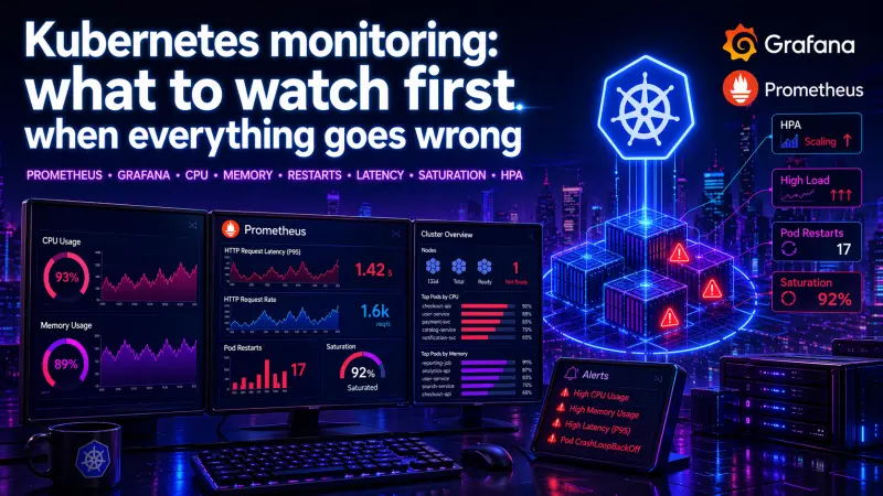
Kubernetes monitoring often fails for a simple reason: teams collect too much before they know what matters. A Grafana dashboard with hundreds of panels can still miss the moment when a service is unavailable, a node is saturated, or HPA is scaling from a misleading signal.
The practical goal is narrower. When production starts to look unhealthy, you need a short path from symptom to cause. The first metrics should answer four questions: are users affected, are workloads alive, are resources saturated, and is autoscaling reacting correctly?
Start with symptoms, not infrastructure noise
A common mistake is to begin with node CPU or pod memory because those graphs are easy to find. They matter, but they are not always the first signal of failure. A cluster can show moderate CPU usage while users see high latency because of queueing, database waits, network retries, or a single overloaded pod behind a service.
A stronger first layer follows a service-oriented order:
Request rate: did traffic change?
Error rate: are responses failing?
Latency: are users waiting longer?
Saturation: is some resource near a limit?
Restarts and readiness: are workloads unstable?
HPA behavior: is autoscaling helping or hiding the issue?
This does not replace infrastructure monitoring. It prevents infrastructure graphs from becoming the first and only explanation.
The best first dashboard is not the biggest one. It is the one that separates user impact from cluster pressure in the fewest steps.
The first Kubernetes metrics to check
The table below is a practical triage order for Prometheus and Grafana dashboards. Exact metric names vary by exporters, ingress controllers, service meshes, and application instrumentation, but the categories remain stable.
Signal | What it tells you | Typical source | First question to ask |
|---|---|---|---|
Request rate | Traffic shape and sudden load changes | Application, ingress, service mesh | Did demand increase or disappear? |
Error rate | User-visible failures | Application, ingress, service mesh | Are failures global or service-specific? |
p95 / p99 latency | Tail behavior under load | Application, ingress, service mesh | Are slow requests isolated or systemic? |
CPU usage vs requests | Compute pressure and throttling risk | kube-state-metrics, cAdvisor | Are pods under-requested or CPU-bound? |
Memory usage vs limits | OOM risk and leak patterns | kube-state-metrics, cAdvisor | Is memory growing until restart? |
Pod restarts | Crash loops and instability | kube-state-metrics | Which pods restarted recently? |
Readiness failures | Traffic routing safety | kube-state-metrics, probes | Are pods alive but not serving? |
Pending pods | Scheduling pressure | kube-state-metrics | Is the cluster unable to place workloads? |
HPA desired replicas | Autoscaling intent | kube-state-metrics | Is HPA asking for more capacity? |
HPA current replicas | Autoscaling result | kube-state-metrics | Did the deployment actually scale? |
The important distinction is intent versus result. For example, HPA may want more replicas, but the scheduler may not place them because nodes lack CPU, memory, or topology capacity. A dashboard that shows only replica count can miss that failure mode.
CPU: usage is useful, throttling is more revealing
CPU usage is often misunderstood in Kubernetes because it must be interpreted relative to requests and limits.
A pod using high CPU is not automatically unhealthy. It may be doing useful work. A pod with low CPU can still be unhealthy if it is blocked on I/O, waiting on locks, or repeatedly crashing before it does work.
The more useful CPU questions are:
Is CPU usage consistently above the requested amount?
Is the container being throttled because of CPU limits?
Are only some replicas hot while others are idle?
Is HPA scaling from CPU while the real bottleneck is latency or queue depth?
Example PromQL-style checks:
sum by (namespace, pod) (
  rate(container_cpu_usage_seconds_total{container!="", image!=""}[5m])
)
sum by (namespace, pod) (
rate(container_cpu_cfs_throttled_seconds_total{container!="", image!=""}[5m])
)CPU throttling is especially important for latency-sensitive services. A service may look “under control” by average CPU while p99 latency rises because bursts are being throttled. For APIs, background workers, and queue consumers, this can create very different symptoms.
Memory: watch limits, restarts, and growth over time
Memory issues in Kubernetes are usually more binary than CPU issues. A container can exceed its CPU request and continue running. A container that exceeds its memory limit is at risk of being killed.
Memory monitoring should focus on three layers:
Current working set relative to limit
Growth pattern over time
OOM kills and restarts
A useful memory graph compares usage to limits by pod or workload:
sum by (namespace, pod) (
  container_memory_working_set_bytes{container!="", image!=""}
)
For production triage, memory is rarely about one isolated number. It is about shape. A steady high-memory workload may be normal. A sawtooth pattern with repeated drops often points to restarts. A slow upward trend over hours may indicate a leak, unbounded cache, oversized batch, or missing backpressure.
Do not rely only on node-level memory. Node pressure matters, but pod-level memory explains which workload is consuming it and whether limits are configured safely.
Restarts: the fastest signal that Kubernetes is recovering from your app
Restarts are one of the most useful early warning signals because they cut through ambiguity. A pod that restarted is not just “a bit slow.” Something killed it, crashed it, or caused it to be replaced.
Start with restart count increases, not total restart count. A pod with a high historical count may be stable now. A pod with three new restarts in the last few minutes deserves attention.
increase(kube_pod_container_status_restarts_total[10m])Restarts should be read together with readiness and liveness behavior. Bad probes can make a healthy application unstable. Weak probes can keep an unhealthy application in rotation.
Probe behavior | Production effect | Operational risk |
|---|---|---|
Liveness too aggressive | Container restarts during slow startup or temporary load | Self-inflicted crash loops |
Readiness too weak | Bad pods continue receiving traffic | User-visible errors |
Readiness too strict | Healthy pods removed during short dependency blips | Capacity drops under load |
No startup protection | Slow boot looks like failure | Repeated restart before initialization |
The practical rule is simple: liveness protects dead processes, readiness protects users, and startup behavior protects slow initialization. Mixing those responsibilities creates noisy incidents.
Latency: averages hide the failure users feel
Average latency is useful for trend watching, but weak for incident response. Kubernetes services usually fail at the tail first. One overloaded replica, one slow dependency, or one queue buildup can make p95 or p99 latency rise while the average still looks acceptable.
For APIs, track latency by route, status class, and workload where possible. For background jobs, track queue age, processing duration, and retry rate. For ingress traffic, separate upstream latency from application latency if your stack exposes both.
A practical latency dashboard should show:
p50, p95, and p99 latency
error rate beside latency
request rate beside latency
latency split by service or endpoint
current replica count beside latency
This matters because latency without load is a different problem from latency under saturation. If request rate is flat and latency rises, suspect dependency waits, locks, cold paths, or degraded downstream systems. If request rate rises and latency rises with CPU or queue depth, suspect capacity.
Saturation: when the cluster cannot absorb more work
Saturation is where Kubernetes monitoring becomes operational rather than decorative. A saturated system is not just busy. It has limited ability to absorb additional work without worse latency, failed scheduling, dropped requests, or restarts.
Important saturation signals include:
Pods pending because they cannot be scheduled
Node CPU or memory pressure
Disk pressure on nodes
Network saturation or connection exhaustion
Queue depth or queue age
Database connection pool exhaustion
HPA at max replicas
Cluster autoscaler unable to add capacity, where applicable
The most actionable saturation view connects application demand to Kubernetes capacity. For example, if queue age is increasing, HPA is at max replicas, and pods are CPU throttled, the problem is not “high load” in the abstract. The system has reached a configured scaling boundary.
HPA: check whether autoscaling is reacting to the right signal
Horizontal Pod Autoscaler is useful, but it can create false confidence. Seeing replicas increase does not prove the service is safe. It only proves the autoscaler observed a scaling signal and requested a change.
A production HPA dashboard should show:
Current replicas
Desired replicas
Min and max replicas
Scaling metric value
CPU or memory requests used by the workload
Pending pods
Latency and error rate beside replica count
The last point is critical. HPA is not the success metric. User impact is.
A minimal HPA configuration might look like this:
apiVersion: autoscaling/v2
kind: HorizontalPodAutoscaler
metadata:
  name: api
spec:
  scaleTargetRef:
    apiVersion: apps/v1
    kind: Deployment
    name: api
  minReplicas: 3
  maxReplicas: 20
  metrics:
    - type: Resource
      resource:
        name: cpu
        target:
          type: Utilization
          averageUtilization: 70
CPU-based autoscaling is often a reasonable starting point for CPU-bound services. It is weaker for I/O-heavy APIs, queue consumers, or services where latency is driven by downstream systems. In those cases, queue depth, request concurrency, or application-level metrics may be more meaningful, depending on how the workload behaves.
Build a dashboard for decisions, not decoration
A useful Kubernetes dashboard should support a fast operational sequence:
Is the service receiving normal traffic?
Are users seeing errors or slow responses?
Which workload is affected?
Are pods restarting, unready, or pending?
Is CPU, memory, or another resource saturated?
Is HPA scaling, capped, or blocked?
Is the issue inside the application, the cluster, or a dependency?
This structure is more useful than grouping every graph by exporter. Engineers do not debug incidents by exporter. They debug by symptom, scope, and constraint.
A practical Grafana layout could be:
dashboard:
  sections:
    - name: User impact
      panels:
        - Request rate
        - Error rate
        - p95 and p99 latency
    - name: Workload health
      panels:
        - Ready replicas
        - Pod restarts
        - Readiness failures
        - Pending pods
    - name: Resource pressure
      panels:
        - CPU usage vs requests
        - CPU throttling
        - Memory usage vs limits
        - Node pressure
    - name: Autoscaling
      panels:
        - HPA current vs desired replicas
        - HPA max replica saturation
        - Scaling metric value
This is not about having fewer metrics forever. It is about making the first screen useful during pressure. Deeper dashboards can still exist for node internals, networking, storage, and application-specific analysis.
What to alert on first
Alerting should avoid noisy “interesting” conditions and focus on symptoms, saturation, and failed recovery.
Strong first alerts usually include:
High error rate for a service
High p95 or p99 latency for a service
Recent restart increase for critical workloads
Pods unavailable for a deployment
Pods pending for longer than expected
HPA at max replicas while latency or queue depth rises
Memory usage close to limit with growth trend
CPU throttling correlated with latency
Weak first alerts often include isolated node CPU thresholds, raw pod CPU usage, or any restart count greater than zero without context. Those may be useful signals, but they are not always pages. Many teams start with too many alerts and train themselves to ignore them.
The better pattern is to alert on user impact and failed self-healing, then use dashboards to explain why.
Conclusion: monitor the failure path, not just the cluster
Kubernetes monitoring is useful when it shows how a service fails under real pressure. CPU, memory, restarts, latency, saturation, and HPA are not separate dashboard decorations. They are connected signals in a failure path.
Start with user impact, then move toward workload health, resource pressure, and autoscaling behavior. Compare CPU to requests, memory to limits, restarts to readiness, latency to load, and HPA desired replicas to actual capacity. That sequence turns monitoring from passive graph collection into production diagnosis.
For engineers who work with Kubernetes as part of delivery, scaling, and operational safety, the most relevant certification to review is Kubernetes Specialist. The useful skill is not memorizing every metric name, but knowing which signal changes the next engineering decision.